Just like Dr. Frankenstein’s monster: it doesn’t matter if your site is filled with eloquent words and a wealth of information, if it’s not well-designed and legible, it’s going to scare people away.
We’ve dubbed these terrifying types of websites “Frankensites” and we’re going to walk you through what exactly they are, how one might accidentally create one, and how to avoid making your own site the stuff of nightmares.
Just in time for Halloween, might we add. Let’s go.
What is a Frankensite?
To define Frankensite, let's think about how Frankenstein was created. Frankenstein was born of alchemy, chemistry, and unorthodox scientific techniques, which resulted in the reanimation of body parts combined to create a creature that was rejected by humanity. A Frankensite is created from HTML, CSS, and JavaScript to the same end: an aesthetically displeasing, malformed, pieced-together site.
Granted, frankensites are in the eye of the beholder: what may be a “design flaw” to one person might be a “feature” to another. However, in general, these sites often have design flaws and usability issues. Many frankensites can be found by Googling terms like ‘ugliest websites’ or ‘worst websites’.
How are Frankensites created?
Frankensites can be created by a site being passed through the hands of many developers and agencies that don’t have a unified vision, or perhaps they received poor direction on what the design should be. They can also be created by developers who are inexperienced in design or don’t have a discerning eye for what they’re building. No matter which way they’re created, their visitors often suffer from a poor user experience. To remedy that, let’s learn about the characteristics of a Frankensite and how to mitigate them.
Characteristics of a Frankensite
There are some aesthetically objectionable sites out there that have great information. However, that information can be difficult to access because it’s not legible or easy to find. Some characteristics of a Frankensite include:
Clashing color schemes
Clashing color schemes and strong background patterns can be very distracting and make it difficult for your user to interact with the information you’re presenting.
Mismatched fonts
A site’s fonts that lack a consistent style can distract from the information you’re presenting. If the size is too small, too large, and inconsistent, it can muddy the page’s hierarchy and thus communicate ineffectively to your users.
Cluttered & unfocused pages
Pages that are cluttered with images and text make it difficult to know what to focus on and can contribute to the user feeling puzzled and overwhelmed.
Difficult to navigate
Without a good navigation bar or menu, users can easily become frustrated as they will have trouble finding what they’re looking for.
Illegible text
When there is not enough contrast between the text and its background color or pattern, it can be difficult to read. The same goes for the font size - if it’s too small or too large, it can be hard to follow.
How to steer clear of the Frankensite
It can be difficult to navigate design elements, especially if you’re not familiar with web design basics. If you’re not comfortable with web design, using a pre-designed template can help guide you and take the stress out of designing your site. However, if you do want to design your website, these rules of thumb should help steer you in the right direction:
Color Schemes
Creating a harmonious color scheme sounds challenging. Take some time to learn about color theory before you start building your site. If you don’t have time for a crash course on color theory, there are many tools out there that can help you choose colors (we recommend Palleton and Adobe’s Color Wheel). Select a limited palette and use your colors judiciously and consistently. If you don’t want a solid background color, try a subtle texture that won’t overwhelm your user. One of my favorite resources is Subtle Patterns.
Fonts
Choose one or two fonts and stick to them. If you’re mixing up fonts, then use them consistently. For example, use one font for the header and the other font for the body text. Choose fonts that are easy to read and size them at a reasonable font point. Body text in 10-point Garamond would be difficult to read - why not try 16-point Calibri or Arial?
Page Layout
Let the page tell a story and guide your user through it. Putting everything on the homepage can overwhelm your user, especially when you’re communicating large amounts of information. So break down what you want to communicate and where you want to direct your user and go from there. For example, if you want to direct your user to a specific page on your site, use a hero image with a straightforward call-to-action. If you want them to keep scrolling down your homepage, use a small bouncing arrow to direct their attention.
Make sure to pay extra attention to page hierarchy. Using consistent font sizing and colors for your headers (making H1s the largest, then progressively making each header smaller through H6s), providing appropriate white space between sections, and keeping margins, columns and sections consistent will help lead them down the page and eventually to purchase.
Navigability
A clear and concise navigation bar helps guide a user through a site and helps them discover what they’re looking for. Put the nav bar in a place where it’s easy and intuitive to find. If you have secondary links that you don’t want to include in your main nav bar because it’s cluttered, try including them in your footer, or use dropdowns to organize and categorize your information.
Legible Text
Ensure the text is legible by making sure there is enough contrast between the color of the text and its background. If the colors are too similar it can be difficult to read. This contrast checker can help ensure that your site is legible for all users. Err on the side of caution and use a standard font that is easy to read like Arial, Helvetica, or Calibri. If you want to use more decorative fonts like scripts then ensure that they’re large enough to be easy to read.
Some of our favorite Frankensites
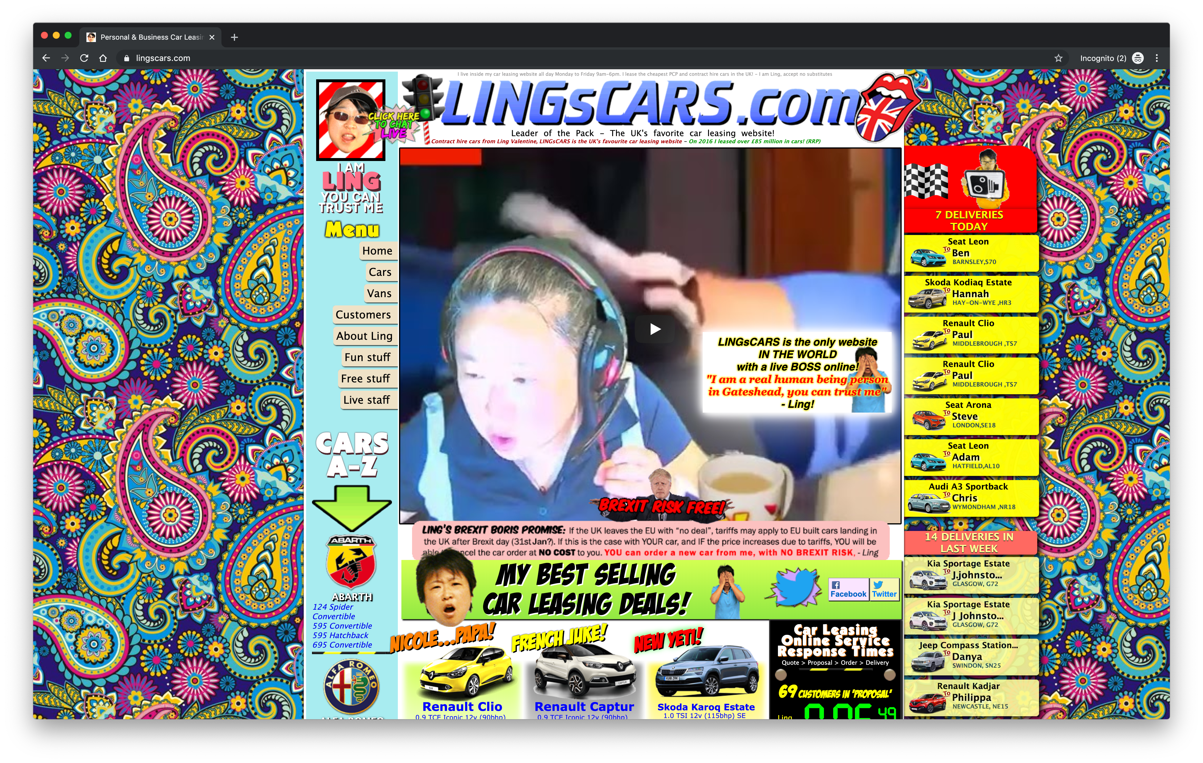
Some sites that appear to be Frankensites but they’re actually gems of marketing genius in disguise. A favorite example of this is Ling’s Cars. While wild looking it offers a playful yet cohesive theme reminiscent of Austin Powers with entertaining graphics and a paisley background. If you inspect the site and look at the <head> you’ll see an image of Ling Valentine coded in an HTML comment--what fun! However not all sites are masquerading as marketing genius… I’ll leave you with some of our favorites:
1.
MGBD Parts and Services
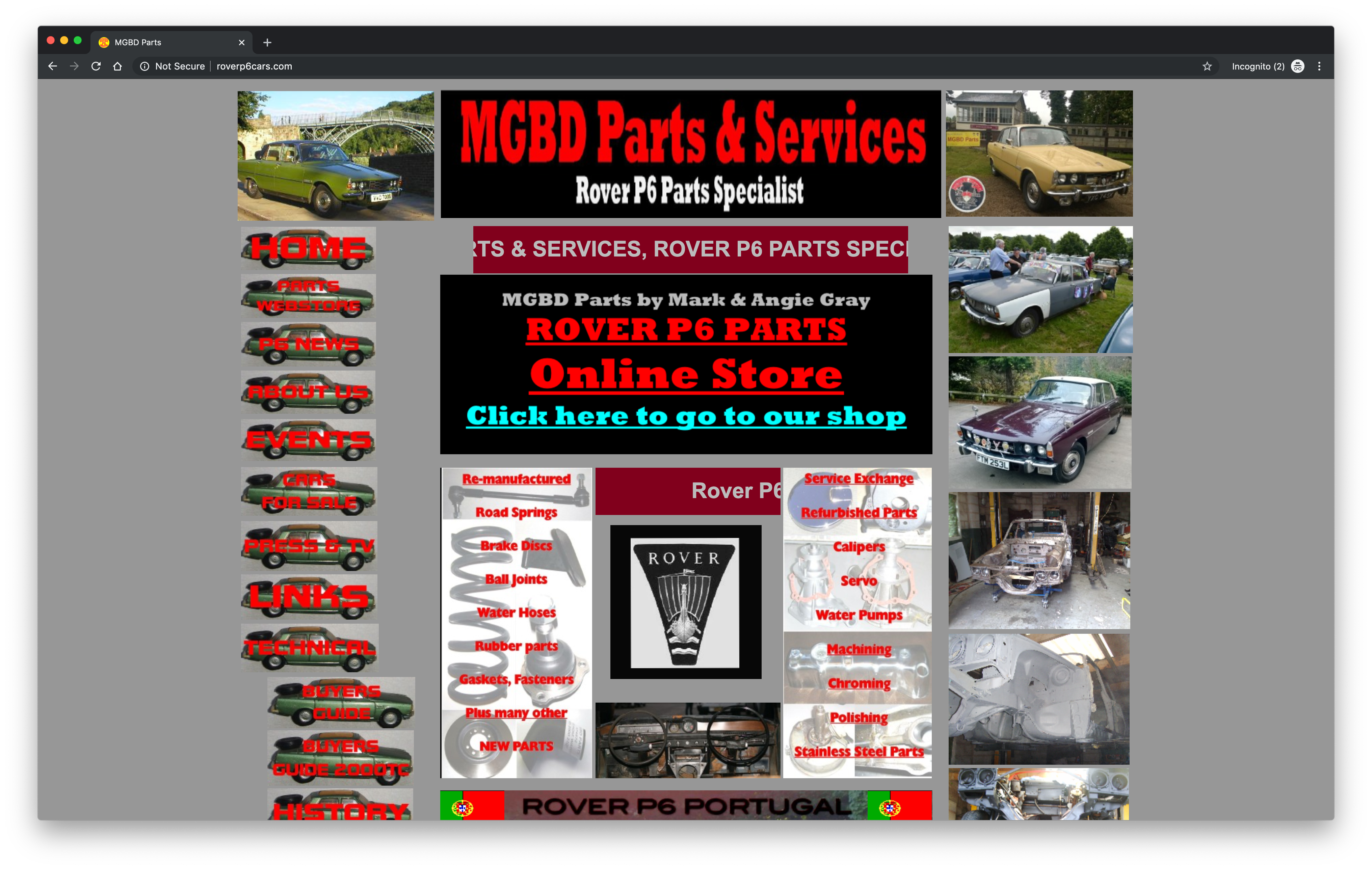
With the trucks used as a background to the sidebar navigation the words are almost impossible to read. It’s not mobile responsive and a couple subpages have some very unpleasant color combinations with large blocks of color which feel randomly dropped in. Others feature red text on a gray background that is difficult to read. While this site contains a wealth of information for its community it’s very difficult to interact with.
2.
Arngren
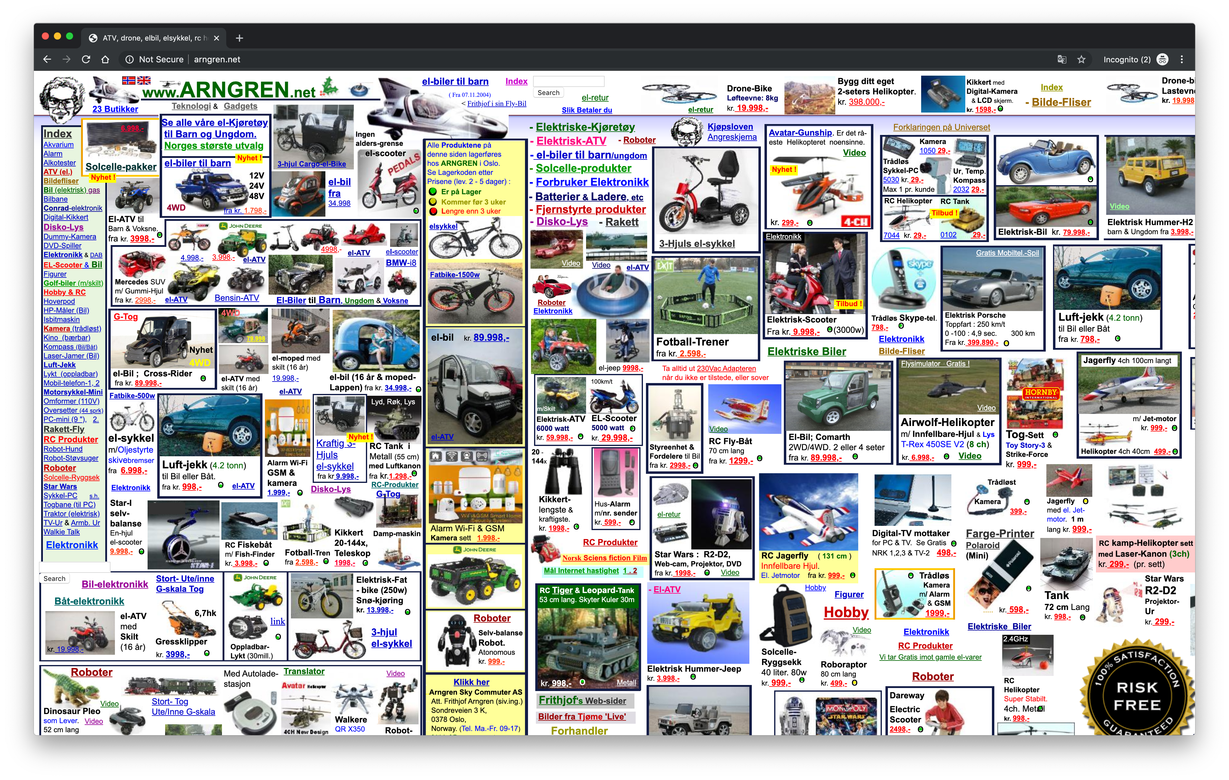
When I landed here it made me think of flipping through the yellow pages: lots of boxes with information that my eyes gloss over and don’t know where to land. With so many images crammed onto the page the sidebar with categories is easily lost.
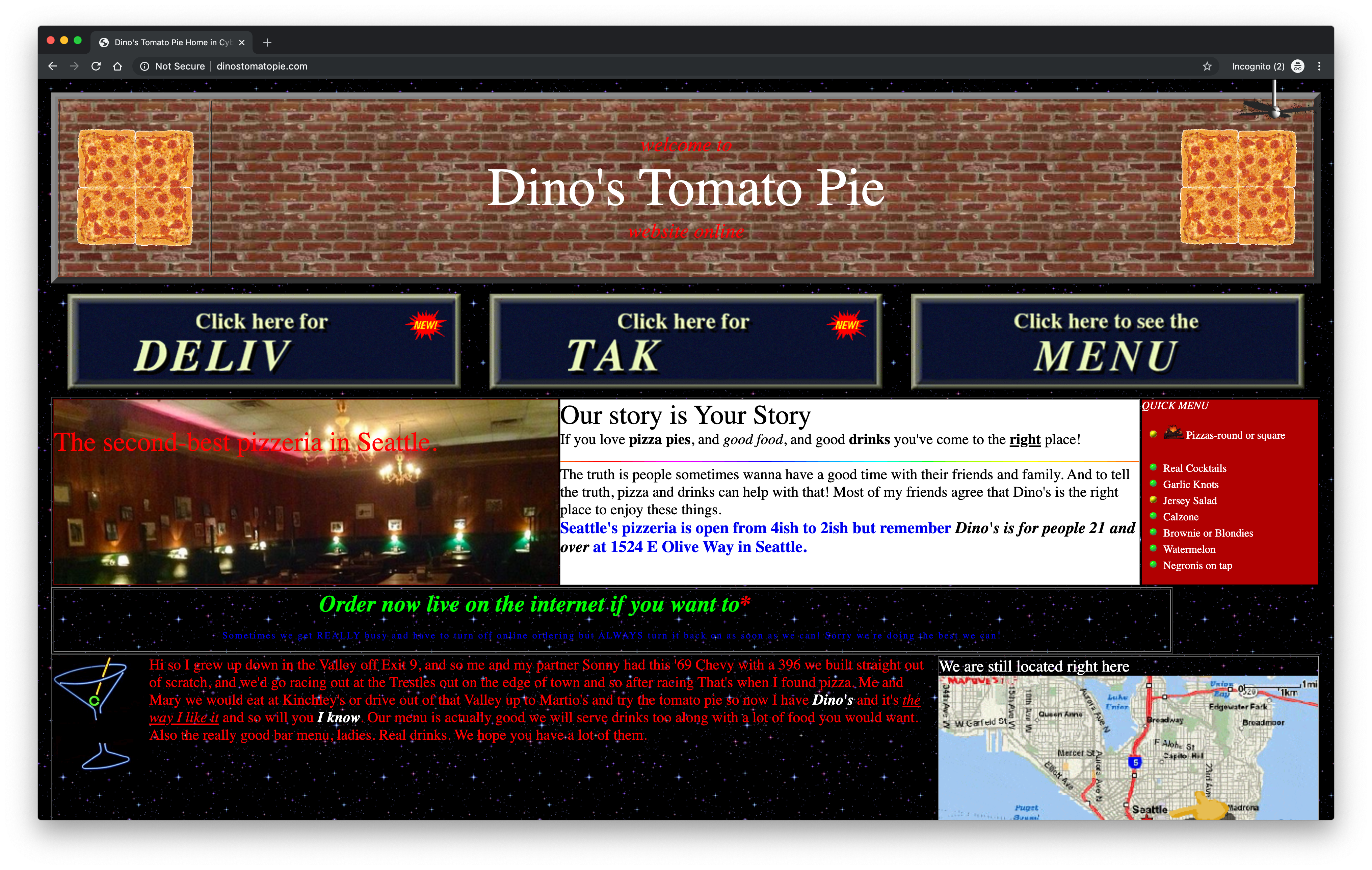
When I landed here I was popped into a time machine and went back to the late 90s. It’s playful and cute with its GIFs of spinning pizzas and a ceiling fan but the flashing text and mixture of Times and Comic Sans in multiple colors on a starry night background is often difficult to read.
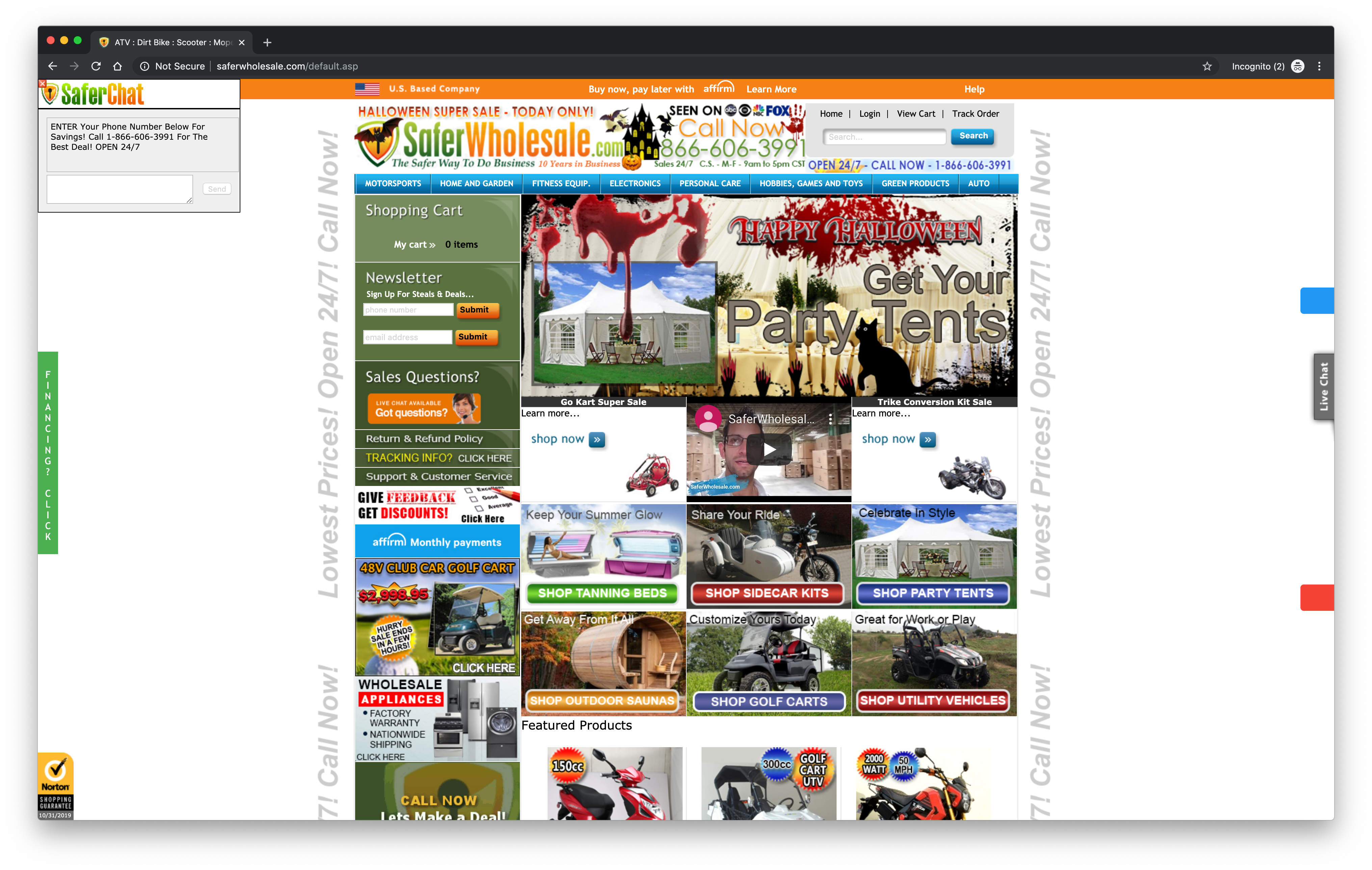
Upon landing on the homepage I was taken aback by all of the tightly packed image blocks with a small, almost hidden YouTube video in the middle. The chatbox that appears in the top left side of the window and slowly scrolls to the right which does get a user’s attention but it’s also distracting. Its tiny nav bar is overwhelmed by the graphics, the mixture of colors, and packed images which result in very suffocating feel and baffled user.
Keep your site from becoming the stuff of nightmares
Creating effective, well-designed websites takes time and effort, but it doesn’t have to be complicated. Rather than focusing on all of the things that can go wrong, we recommend spending some time aligning your website with your brand and taking these simple steps above to create a streamlined website. Make sure to unify your vision with the vital teams involved in your website, then start experimenting.
And you never know, even if your website does become a Frankensite, it may just become the stuff of legends.
Learn more about how to prevent your site from becoming a Frankensite (read: liability).
By Katie Moser
Katie is the Senior Marketing Manager for Zesty.io. Her expertise lies in crafting marketing strategy, with an emphasis on content and digital marketing. Having spent too much time in clunky CMS's, Katie understands the need for a CMS that works with you - not against you. In her free time, you can find Katie in San Diego enjoying the sunshine at the beach or on hikes.